Data Visualizations
Below are select examples of my data visualizations from the Pregnancy, Arsenic, and Immune Response (PAIR) Study, a pregnancy and birth cohort based in rural northern Bangladesh. Figures were made using R’s ggplot2.
In 2018-2019, the PAIR Study enrolled 784 pregnant women in the early second trimester in Gaibandha District, Bangladesh. We followed women to the end of pregnancy. If pregnancy ended in live birth, we followed mother-infant pairs to three months postpartum. We conducted up to two major study visits in pregnancy (below, Visits 1 and 2) and up to two major study visits postpartum (Visits 3 and 4). For more information, see our published cohort profile.
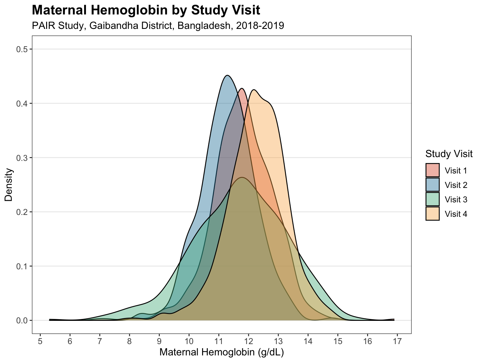
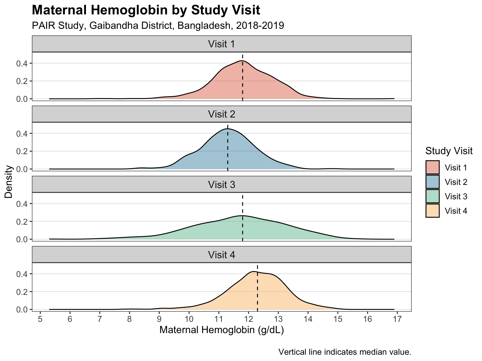
Density Plot: Maternal Hemoglobin by Study Visit
Below, density plots show distributions of maternal hemoglobin, the oxygen-transport protein, by study visit. The distributions follow an expected pattern: a decrease in hemoglobin over pregnancy (Visits 1 to 2) and an increase following live birth (Visits 2 to 3 to 4). Visit 3 was conducted in the weeks after live birth when maternal hemodynamics are highly variable, which is reflected by the higher dispersion.
Single Facet
Multiple Facets
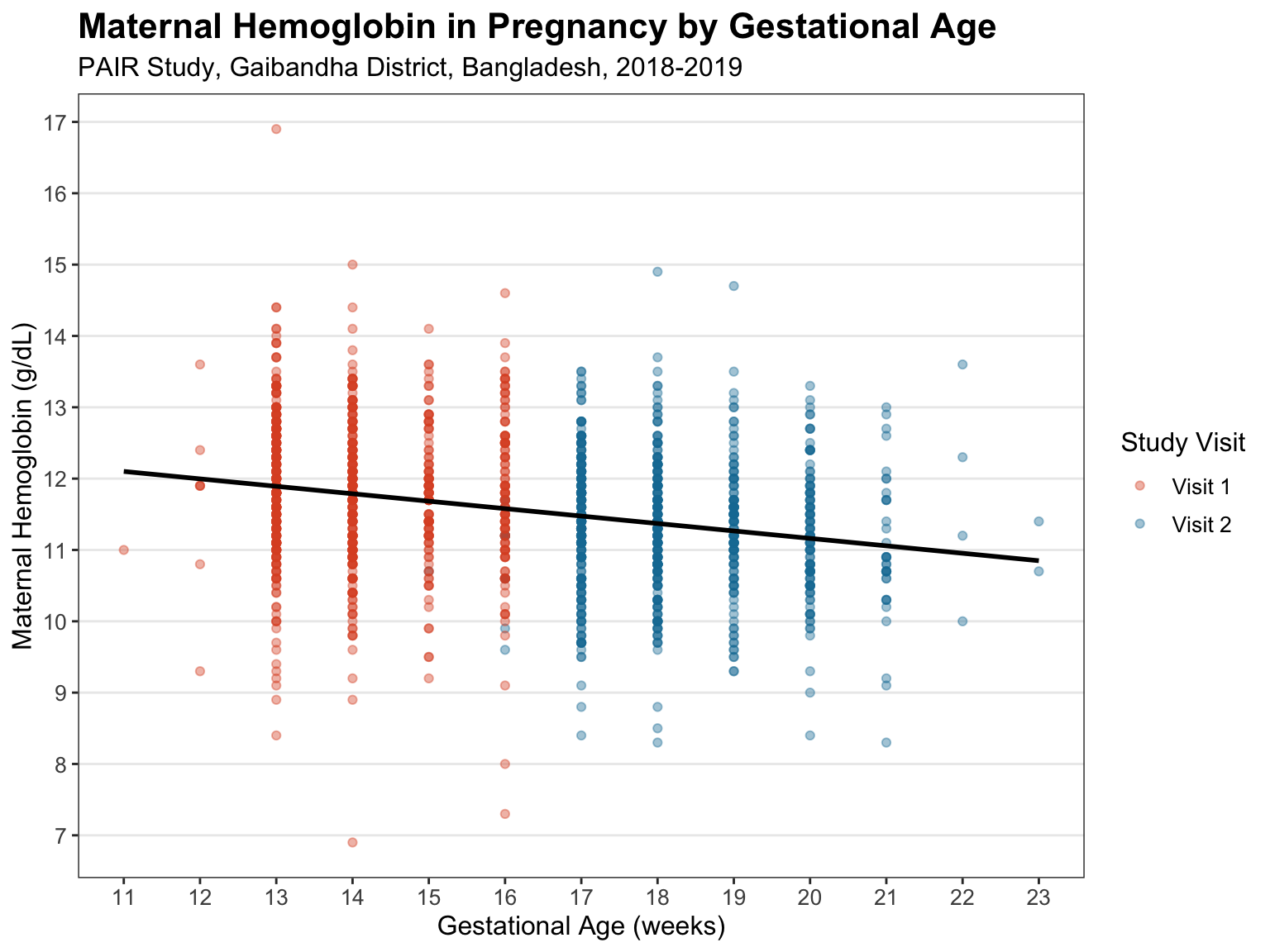
Scatter Plot: Maternal Hemoglobin in Pregnancy by Gestational Age
Below, a scatter plot shows maternal hemoglobin by gestational age in pregnancy (Visits 1 and 2). In pregnancy, the blood plasma volume expands to support increased circulation in the woman and fetus. This results in “hemodilution,” which is reflected by the negative association between hemoglobin and gestational age.
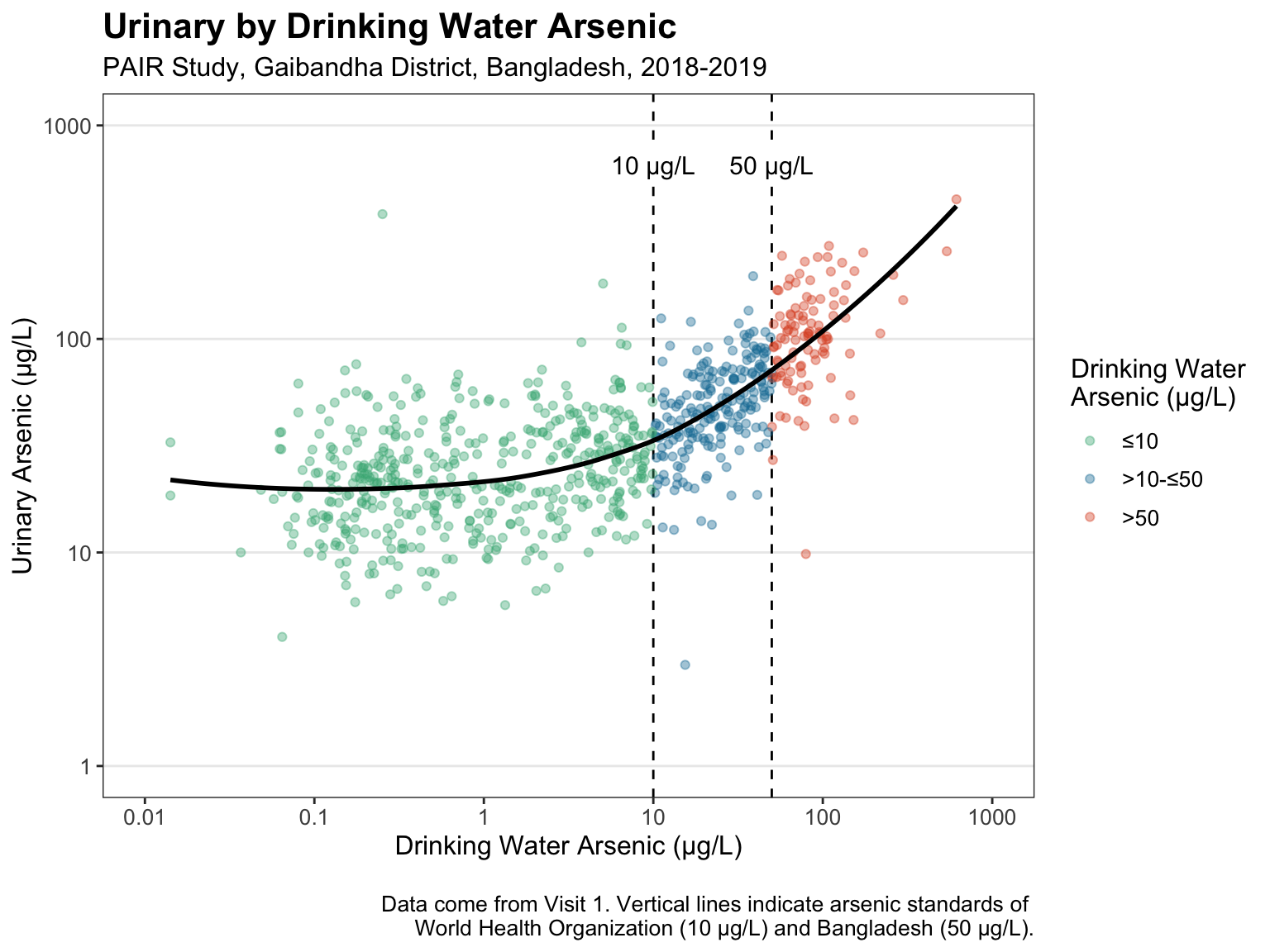
Scatter Plot: Urinary by Drinking Water Arsenic
Below, a scatter plot shows urinary arsenic by drinking water arsenic among pregnant women at Visit 1. Bangladesh has some of the highest arsenic exposures in the world due to naturally occurring arsenic in groundwater, which is used for drinking and irrigation. Urinary arsenic is a widely used measure of total arsenic exposure. The plot below confirms that drinking water is a key source of total arsenic exposure.
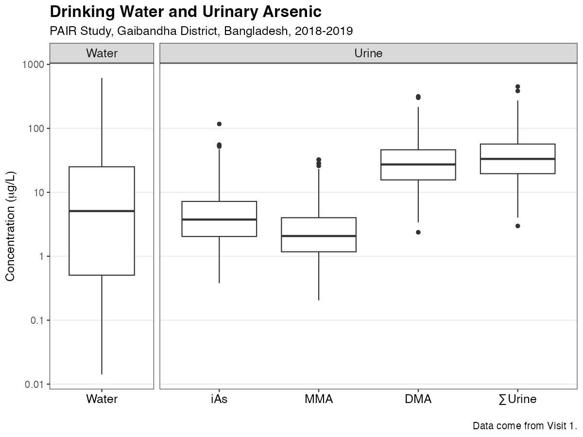
Box Plot: Drinking Water and Urinary Arsenic
Below, a box plot shows distributions of drinking water arsenic and different “species” or forms of urinary arsenic, including inorganic, monomethyl, and dimethyl arsenic (iAs, MMA, and DMA, respectively) and their sum.
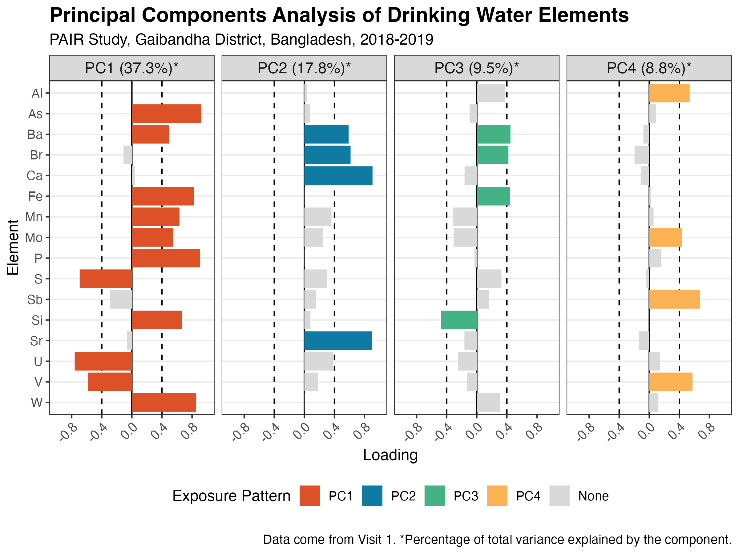
Bar Plot: Principal Components Analysis of Drinking Water Elements
Below, a bar plot shows loadings for a principal components analysis (PCA) of drinking water elements. Arsenic may co-occur with other elements, some of which are toxicologically significant. PCA was used to identify which elements tend to co-occur, which suggests typical exposure patterns in the population.
Four of 16 components explained 73.4% of total variance. As shown by PC1, arsenic (As) tended to co-occur with several toxicologically significant elements, including iron (Fe) and manganese (Mn).